Make every hour of service count.
Headlines, pull quotes, and large numbers. Use Medium (500) for headlines, and italic sparingly for emphasis.
Fallback: Georgia, serif
Brand guidelines
How to use the coalition’s logo, colors, type, and voice. For partners, press, and anyone creating materials about the coalition.
The symbol
The symbol shows six people joined in a ring: the six founding partners, and the people and organizations they serve together.
Always use the master files. Don’t redraw, trace, or rebuild the symbol.
Use full color whenever you can. Choose the variation that matches the background, not the other way around.
The default. Use on white, the Paper neutrals, and other light backgrounds.


White tile for apps and social avatars. The favicon is a simplified symbol: the ring without heads, in a heavier stroke, filling the whole icon.
Single-color printing, forms, faxes, and engraving.
Single-color use on dark backgrounds or on a dark, even area of a photo.
Emblems
The horizontal emblem is the primary logo. Use the stacked emblem in narrow or square spaces, and the symbol alone only when the coalition’s name appears nearby.
Measure everything from the symbol’s height, H.
Color
Emerald is the primary accent and Pine the secondary accent. Every other color supports them: the six support hues, which appear together in the symbol, and the neutrals that carry most layouts. Don’t assign a hue to a particular partner.
#22c55e
Accent fill: buttons, badges, progress, success
#0f7a45
Small accent text on light backgrounds
#134335
Buttons and links
#08261d
Dark sections and the footer
Support hues
#ef5b3bRGB 239 91 59
Large text and icons 3.1:1 on Paper 200
#f2a516RGB 242 165 22
Decoration only 1.9:1 on Paper 200
#1e7a55RGB 30 122 85
Text and icons 4.9:1 on Paper 200
#12a5a0RGB 18 165 160
Decoration only 2.8:1 on Paper 200
#2e7fd8RGB 46 127 216
Large text and icons 3.8:1 on Paper 200
#8a4fc9RGB 138 79 201
Text and icons 4.8:1 on Paper 200
Contrast is measured against Paper 200 (#fcf5ee). Only Evergreen and Violet are dark enough for body text on light backgrounds. On Pine 950, every “on dark” value works for text.
Neutrals
#fffdf8
Cards and panels
Raised surfaces
#fcf5ee
Page background
Default background
#f6ecdf
Tinted sections and panels
Alternate background
#13211c
Body text, the wordmark, monochrome symbols
15:1 on Paper 200
Typography
Both typefaces are free under the SIL Open Font License and available from Google Fonts.
Make every hour of service count.
Headlines, pull quotes, and large numbers. Use Medium (500) for headlines, and italic sparingly for emphasis.
Fallback: Georgia, serif
Find, serve, verify, report.
Body text, interface, labels, and the wordmark. Regular (400) for body copy, SemiBold (600) for labels, Bold (700) for the wordmark and buttons.
Fallback: system-ui, sans-serif
| Style | Typeface | Size | Line height |
|---|---|---|---|
| Display | Newsreader Medium | 40–64 px | 1.05 |
| Heading | Newsreader Medium | 32–50 px | 1.08 |
| Body | Public Sans Regular | 17 px | 1.6 |
| Eyebrow | Public Sans Bold, caps, 0.13 em tracking | 12.5 px | 1.2 |
Iconography
Every icon comes from Phosphor (opens in a new tab), in the Bold weight. It’s open source and free under the MIT license. Pick new icons from the same set and weight so they match the ones already on the site.
Co-branding
On coalition materials, the coalition logo leads and partner logos follow as equals.
Founding partners




Voice and tone
We write for people enrolled in Medicaid, SNAP, and TANF; for the nonprofits that host volunteers; for State and federal agencies; and for the press. The same words have to earn the trust of all of them.
Plain language first: short sentences, common words, one idea at a time. Aim for a 6th-grade reading level on public pages, and check it with a readability tool before you publish.
Say what is changing and what to do next. State deadlines as facts, never as threats.
We serve everyone affected. Use official program terms, not political nicknames for laws.
Put people first. Describe what people do, not what category they fall into.
| Write | Instead of |
|---|---|
| community engagement requirements (“work requirements” is fine as a secondary term) | political nicknames for the law |
| H.R. 1 (2025) on first reference when the bill number helps, then “the law” | HR1 alone, which will mean a different bill in the next Congress |
| people enrolled in Medicaid, members, participants | welfare recipients, able-bodied adults (except when quoting the law) |
| State agencies (capital S for State government) | the states, when you mean agencies |
| the Volunteer Pathways Coalition, then “the coalition” | VPC, Pathways |
| 211 (“the 211 health and human services helpline” in formal text) | 2-1-1 |
| “free” only for what is free, with paid options named plainly | “free” for tools that have paid tiers |
Downloads
SVG for anything digital or printed at any size. PNG for documents and slides. Overlap colors are flat fills in the files, so they look the same in every app.

The primary logo

Single-color print

Single-color on dark
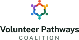
Narrow or square spaces
Single-color print

Single-color on dark

Light backgrounds

Single-color print

Single-color on dark
Favicons, apps, social avatars
Browser tabs and bookmarks